Page 4 - Digi Notes -Maths - 08 April
P. 4
www.mahendraguru.com
Introduction:
In the previous two digi-notes on Data Interpretation; we discussed The Table Chart and
Pie Chart. Now let us do some data analysis with the help of Column/Bar Graph.
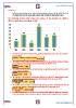
The following column graph shows the number of the students (in 1000) in
different institutions in a college in 2015
70 65
60
50
40 38
40
32
30
20
20 15
10
0
HIT ABC ZMR WER THE KIT
1. Find the average of the number of the students in institutions ABC, THE, ZMR and KIT in
the year 2015.
+ + +
=
2. The number of the students in WER in the years 2015 is approximately what percentage
of the number of the students in all the institutions in the year 2015?
× ≅ %
3. The number of the students in the institution KIT is approximately what % of the number
of the students in WER?
× ≅ %
4. The number of the students in institution WER in the year 2015 is approximately what
% more than the number of the students in institution ABC in the years 2015?
~
× = . %
5. The number of the students in institution ABC in the year 2015 is approximately what %
less than the number of the students in institution WER in the years 2015?
~
× ≅ %
6. In which institution the percentage of the number of the students is highest as compared
to the total number of the students in all the institutions taken together in the year 2015.
www.mahendraguru.com
Introduction:
In the previous two digi-notes on Data Interpretation; we discussed The Table Chart and
Pie Chart. Now let us do some data analysis with the help of Column/Bar Graph.
The following column graph shows the number of the students (in 1000) in
different institutions in a college in 2015
70 65
60
50
40 38
40
32
30
20
20 15
10
0
HIT ABC ZMR WER THE KIT
1. Find the average of the number of the students in institutions ABC, THE, ZMR and KIT in
the year 2015.
+ + +
=
2. The number of the students in WER in the years 2015 is approximately what percentage
of the number of the students in all the institutions in the year 2015?
× ≅ %
3. The number of the students in the institution KIT is approximately what % of the number
of the students in WER?
× ≅ %
4. The number of the students in institution WER in the year 2015 is approximately what
% more than the number of the students in institution ABC in the years 2015?
~
× = . %
5. The number of the students in institution ABC in the year 2015 is approximately what %
less than the number of the students in institution WER in the years 2015?
~
× ≅ %
6. In which institution the percentage of the number of the students is highest as compared
to the total number of the students in all the institutions taken together in the year 2015.
www.mahendraguru.com